World Usability Day falls on 12 November, and this year's theme is "Designing a Sustainable Future with Ethical AI". In healthcare, usability is not decoration. A task that takes three extra clicks is repeated hundreds of times a day, and a confusing screen is not just annoying: it can lead to mistakes with real patients.
Here are seven mistakes we see again and again in clinical and practice software, and how to fix each one.
Facts checked on 2 November 2026.
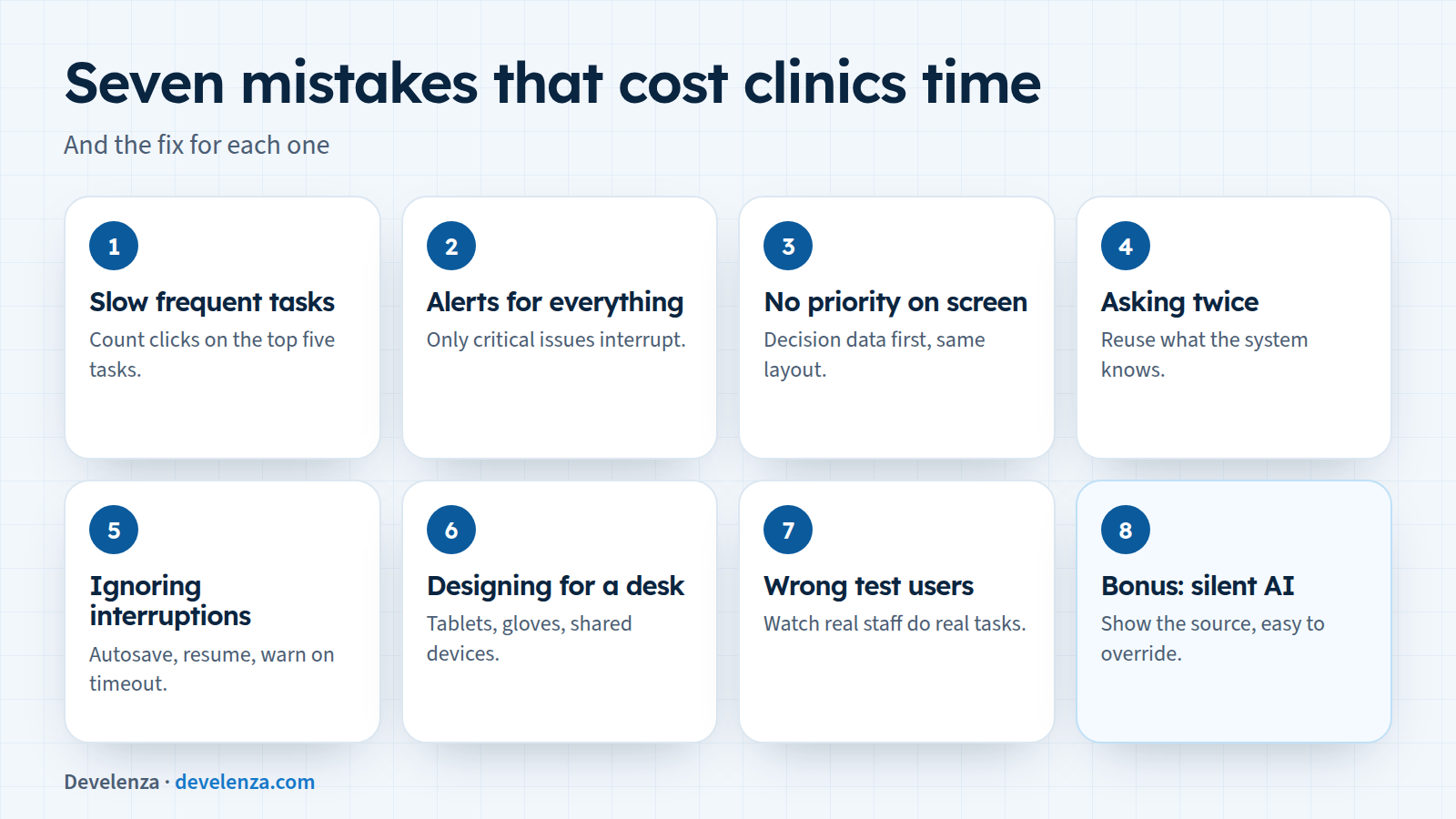
1. Making frequent tasks slow
Booking an appointment, checking in a patient or repeating a prescription might happen 200 times a day. If each one takes six screens, that adds up to hours every week.
Fix: list the five most frequent tasks, count the clicks and time each one with a real user. Then shorten them with sensible defaults, recent items, keyboard shortcuts and fewer confirmation steps.
2. Alerts for everything
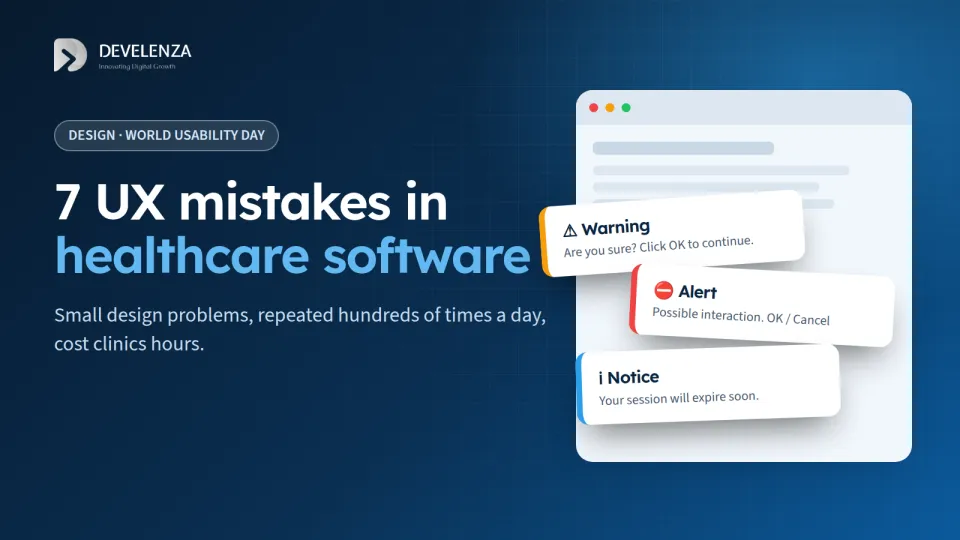
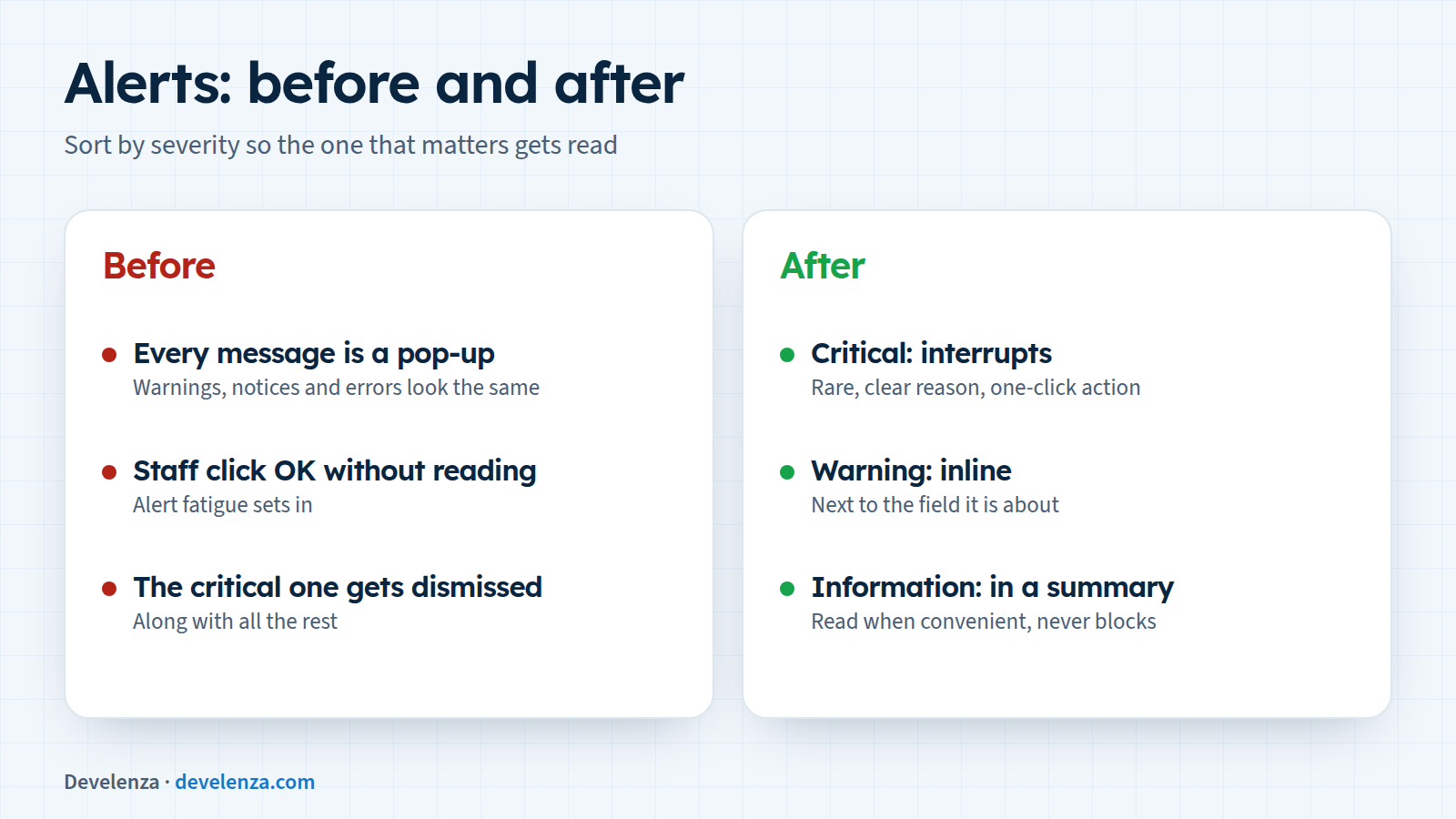
When every warning is a pop-up, staff learn to click "OK" without reading. This is called alert fatigue, and it means the one alert that really matters gets dismissed with the rest.
Fix: sort alerts by severity. Only critical issues should interrupt. Warnings can sit inline next to the field they relate to, and information can wait in a summary. Every alert should say why it appeared and offer the next action in one click.
3. Screens with no priority
If allergies, the next appointment and the billing code all have the same size, colour and weight, the eye has nowhere to start.
Fix: decide what the user needs for the decision in front of them and put it first. Keep the same layout from patient to patient so people know where to look. Use colour sparingly and never as the only signal.
4. Asking for the same information twice
Typing a patient's address at reception and again in the referral form wastes time and creates two versions of the truth.
Fix: reuse what the system already knows and let people confirm it instead of retyping it. WCAG 2.2 even makes this an accessibility requirement: its "Redundant Entry" rule says information already entered in the same process should be filled in or available to select.
5. Ignoring interruptions
Clinicians are interrupted all the time: a phone call, a colleague, an emergency. Software that loses a half-finished note when someone walks away fails them.
Fix: save drafts automatically, show clearly where the user left off, and warn before a session times out instead of throwing work away.
6. Designing for a desk, not the ward
Many designs are tested on a large monitor in a quiet office. Real use happens on shared computers, tablets on trolleys, in poor light, sometimes with gloves on.
Fix: large touch targets, strong contrast, readable text without zooming, and fast switching between users on shared devices.
7. Testing with the wrong people
Managers, the development team and the person who wrote the requirements are not the people who will use the software at 3 a.m.
Fix: watch real staff do real tasks, in their own setting if you can. You do not need big studies. Small rounds of about five users, repeated after each change, catch most of the obvious problems.
A note on AI, this year's theme
AI features such as note summaries and coding suggestions are arriving in clinical software fast. Good usability here is also good ethics:
- Show where a suggestion came from and how confident the system is.
- Make it easy to accept, edit or reject, and never fill clinical fields silently.
- Keep a record of what the AI suggested and what the person decided.
Find your own mistakes in a week
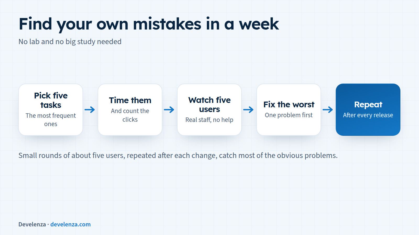
- Pick the five most frequent tasks.
- Time them and count the clicks.
- Watch five real users do them, without helping.
- Fix the worst problem first.
- Repeat after every release.
How Develenza can help
We design and build healthcare software with the people who use it, from patient portals to clinical tools. If your staff have learned to work around your software, contact us for a usability review, or start your project if you are planning something new.
Sources
- World Usability Day
- W3C: Understanding WCAG 2.2 Redundant Entry
- AHRQ PSNet: Alert Fatigue
- Nielsen Norman Group: Why You Only Need to Test with 5 Users